The idea behind this project is the disparities that exist in the composition of color used in different styles of painting.
These differences could firstly be used to identify the style, and secondly used to cross-examine art of the same style but through different artists or different pieces.


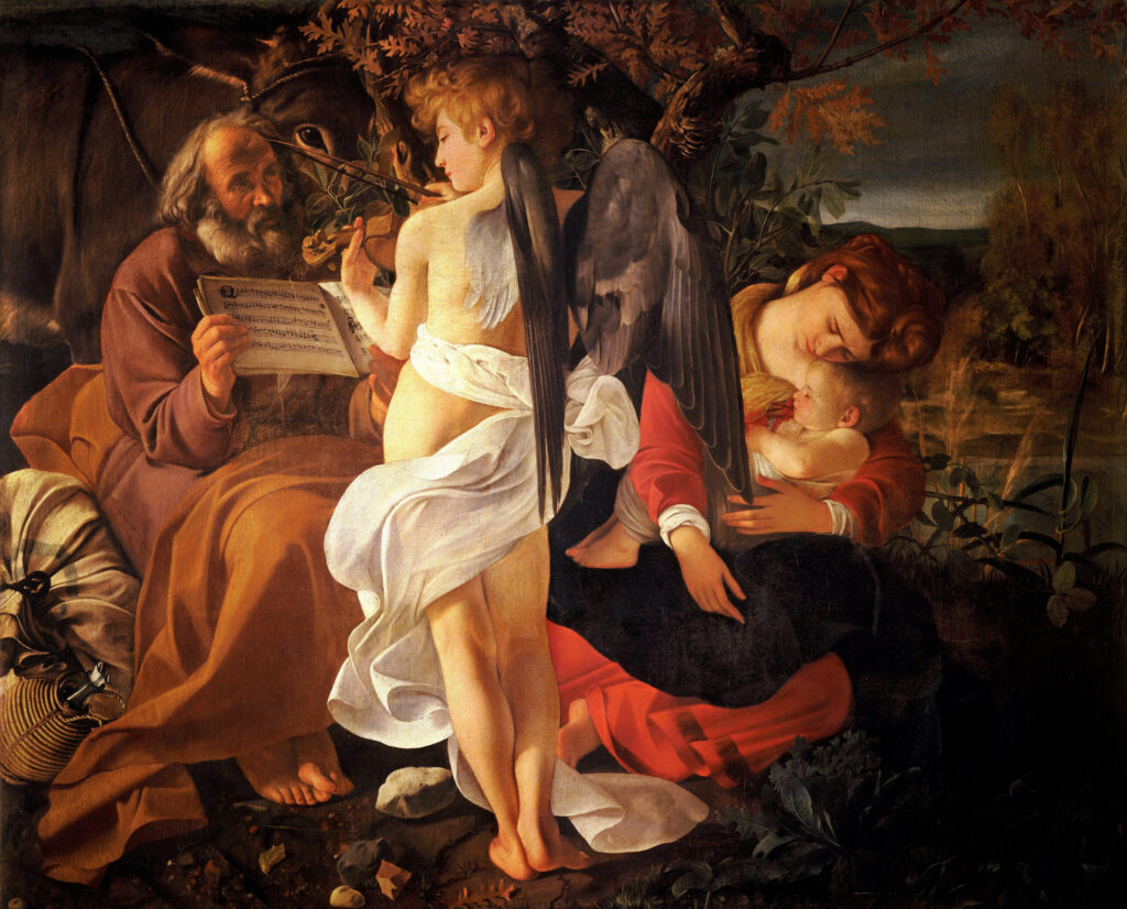
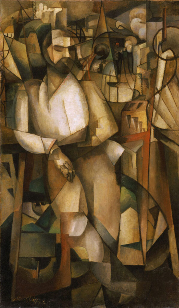
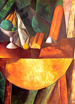
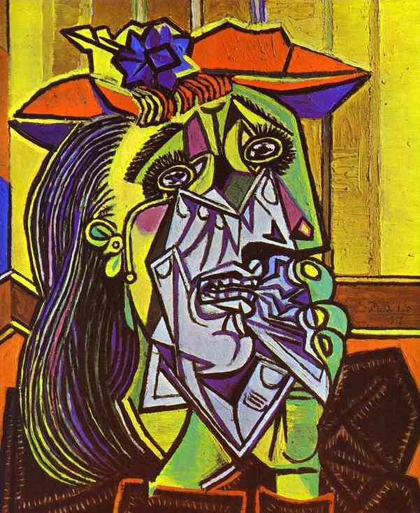
Cubism
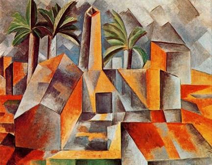
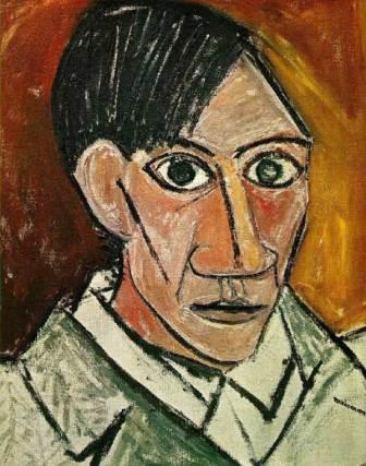
The final category I decided to include are Cubist paintings which are mostly of Picasso. These are extremely colorful and mosaic.

In the next post, you’ll be able to see code snippets and analysis of the image pixel data!
-
Image Comparing Software, Part Two: Individual results, modules, and methods.

Extracting Pixel Data The way I went about analyzing our image data is by using PIL, or the Python Imaging Library. It allows us to grab the pixel data for each individual painting in our dataset. This would allow me to get the RGB data, and convert it into its closest available X11 color which…