bambriz.me
Project Portfolio
Image Comparing Software, Part Two: Individual results, modules, and methods.

Extracting Pixel Data
The way I went about analyzing our image data is by using PIL, or the Python Imaging Library. It allows us to grab the pixel data for each individual painting in our dataset. This would allow me to get the RGB data, and convert it into its closest available X11 color which is able to be displayed using Matplotlib’s color library.
import pandas as pd
import numpy as np
import os
import PIL
import sys
import matplotlib
import webcolors
from IPython.display import display, Image
from matplotlib import pyplot as plt
from io import BytesIO
from collections import Counter
from PIL import Image as PILimage
PIL.Image.MAX_IMAGE_PIXELS = 933120000
%matplotlib inline
''' Color-comparison of 3 styles of art. Cubist, Impressionist, and Baroque.
    10 Images per style, each taken from public domain.
'''
def load_styles():
    #These are the paths to the files in the local directory
    path_baroque = './Baroque'
    path_cubist = './Cubist'
    path_impressionism = './Impressionism'
    #This is a dataframe that will hold the image objects, extensions, and names/style
    styles = pd.DataFrame()
    series_objects = []
    number_colors = 256

    #Gets each individuals pixel data in RGB
    #As well as adds a column to convert RGB into human readable colors
    #later , (ex. Black, brickRed)
    for baroquefile in os.listdir(path_baroque):
        if baroquefile != '.DS_Store':
            imageadded = PILimage.open(path_baroque + '/' + baroquefile)
            pallet_mode = imageadded.getdata()
            array_like = list(pallet_mode)
            imageadded.close()
            fn, fext = os.path.splitext(baroquefile)
            toAdd = pd.Series(name = fn, data = {'web_colors':np.nan,'color_array': array_like, 'color_sequence': pallet_mode, 'color_length': len(array_like),'extension': fext, 'style': 'Baroque'})
            series_objects.append(toAdd)
    for cubistfile in os.listdir(path_cubist):
        if cubistfile != '.DS_Store':
            imageadded = PILimage.open(path_cubist + '/' + cubistfile)
            pallet_mode = imageadded.getdata()
            array_like = list(pallet_mode)
            imageadded.close()
            fn, fext = os.path.splitext(cubistfile)
            toAdd = pd.Series(name = fn, data={'web_colors':np.nan,'color_array': array_like, 'color_sequence': pallet_mode, 'color_length': len(array_like), 'extension': fext, 'style': 'Cubist'})
            series_objects.append(toAdd)
    for impressionistfile in os.listdir(path_impressionism):
        if impressionistfile != '.DS_Store':
            imageadded = PILimage.open(path_impressionism + '/' + impressionistfile)
            pallet_mode = imageadded.getdata()
            array_like = list(pallet_mode)
            imageadded.close()
            fn, fext = os.path.splitext(impressionistfile)
            toAdd = pd.Series(name = fn, data={'web_colors': np.nan, 'color_array': array_like,'color_sequence': pallet_mode, 'color_length': len(array_like),'extension': fext, 'style': 'Impressionist'})
            series_objects.append(toAdd)

    return styles.append(series_objects)

styles = load_styles()
Feature Engineering
This next block of code is responsible for creating a column in our data frame for creating our color data.
def convertAdd_rgbColumn():
    #Converts RGB to Color
    def closest_colour(requested_colour):
        min_colours = {}
        for key, name in webcolors.css3_hex_to_names.items():
            r_c, g_c, b_c = webcolors.hex_to_rgb(key)
            rd = (r_c - requested_colour[0]) ** 2
            gd = (g_c - requested_colour[1]) ** 2
            bd = (b_c - requested_colour[2]) ** 2
            min_colours[(rd + gd + bd)] = name
        return min_colours[min(min_colours.keys())]

    def get_colour_name(requested_colour):
        try:
            closest_name = actual_name = webcolors.rgb_to_name(requested_colour)
        except ValueError:
            closest_name = closest_colour(requested_colour)
            actual_name = None
        return closest_name

    paintingColorMatches = pd.Series(index=styles.index)
    for painting in styles.index:
        color_array = map(get_colour_name, styles.loc[painting].loc['color_array'])
        paintingColorMatches.loc[painting] = color_array
    styles['web_colors'] = paintingColorMatches

convertAdd_rgbColumn()
Data Preparation via Compression
One setback I originally had to overcome was the immense amount of pixels I was mapping over. I originally intended to use all available pixel data from the source images, but I soon realized that this was computationally expensive work and that I would either have to create a more efficient program or to lower the number of pixels I would use by compression.
Before compression, the sum of our pixels was generally greater than 2 million for the bigger and denser paintings, and an average of 500,000 to 700,000 for the rest. With a total of 30 paintings, this was too large of a dataset.
After compression, the sum of our pixels was about 60,000 for the larger paintings, and an average of 30,000 to 50,000 for the rest, which lowered the estimated runtime of ratios(), our function that converted our RGB maps to x11, from an hour to about 1 minute.
'''
creating a dictionary of the set of complete web_colors, iterating over each paintings
web_color map, and getting the counts as compared to the ratio of the complete image.
'''
import multiprocessing
def ratios():
    count_array = []
    for painting in styles.index:
        counts = {}
        print(painting)
        for value in styles.loc[painting].loc['web_colors']:
            if value not in counts.keys():
                counts[value] = 1
            else:
                counts[value] += 1
        count_array.append(counts)
        print(counts)
#Ran the following script & saved the output.
#Having it run takes around ~30 minutes for 30 files.
'''if __name__ == '__main__':
    jobs = []
    for i in range(5):
        p = multiprocessing.Process(target=ratios)
        jobs.append(p)
        p.start()
'''
Below is the output from the command above, except cleaned and formatted into a dictionary.
dictionary_array = [
{'black': 7751, 'darkslategrey': 16896, 'teal': 99, 'darkslateblue': 185, 'seagreen': 5, 'dimgrey': 5602, 'darkolivegreen': 3955, 'steelblue': 31, 'slategrey': 1113, 'grey': 3096, 'lightslategrey': 355, 'darkseagreen': 9, 'rosybrown': 2212, 'darkgrey': 763, 'tan': 1458, 'silver': 990, 'sienna': 1287, 'lightgrey': 852, 'antiquewhite': 221, 'wheat': 212, 'gainsboro': 486, 'bisque': 38, 'peru': 279, 'indianred': 121, 'midnightblue': 107, 'saddlebrown': 1913, 'thistle': 3, 'peachpuff': 7, 'pink': 4, 'lightpink': 10, 'darkkhaki': 225, 'olivedrab': 14, 'darksalmon': 9, 'burlywood': 8, 'beige': 16, 'linen': 99, 'oldlace': 11, 'seashell': 9, 'floralwhite': 10, 'snow': 3, 'maroon': 698, 'whitesmoke': 11, 'ivory': 1, 'mistyrose': 3, 'brown': 18, 'white': 2, 'darkgreen': 1, 'palegoldenrod': 1, 'darkgoldenrod': 1},
{'black': 28142, 'darkslategrey': 12236, 'darkolivegreen': 3949, 'dimgrey': 2156, 'grey': 1297, 'saddlebrown': 1261, 'sienna': 1919, 'indianred': 246, 'rosybrown': 1015, 'darkgrey': 306, 'maroon': 244, 'tan': 154, 'peru': 177, 'silver': 115, 'lightgrey': 3, 'darkkhaki': 5, 'slategrey': 244, 'darkslateblue': 87, 'lightslategrey': 102, 'brown': 52, 'darkred': 1, 'midnightblue': 89}, [CONTINUED] ---
{'tan': 1643, 'rosybrown': 11899, 'grey': 4896, 'indianred': 1614, 'sienna': 842, 'dimgrey': 3081, 'darkkhaki': 62, 'darksalmon': 15, 'darkolivegreen': 718, 'darkslategrey': 7249, 'black': 8146, 'peru': 86, 'silver': 660, 'saddlebrown': 89, 'darkgrey': 1758, 'lightgrey': 152, 'antiquewhite': 1, 'gainsboro': 24, 'maroon': 8, 'darkseagreen': 91, 'wheat': 38, 'lightslategrey': 981, 'palegoldenrod': 16, 'midnightblue': 220, 'darkslateblue': 187, 'slategrey': 1108, 'darkgreen': 1, 'lightsteelblue': 55, 'beige': 2, 'burlywood': 8, 'cadetblue': 62, 'steelblue': 28, 'lightblue': 8, 'seagreen': 44, 'mediumseagreen': 2, 'teal': 1, 'skyblue': 1, 'powderblue': 4}]


color_counts = pd.Series(index=styles.index, data = dictionary_array)
styles['color_count'] = color_counts
Data Analysis
Afterward, I continued the analysis by only estimating the average ratios per painting for colors that showed greater than 5 percent of all colors, and using a Matplotlib bar chart to show those colors using the function colored_graphs(), which takes a painting style as it’s the only parameter.
'''
    Finally, let's display our matplots.
    // I decided to shorten the amount
       of colors displayed on the x-axis by limiting the
    // percent of measurable significance on the ratio of colors.

    // For example, if the ratio of pixels for the color 'blanchedalmond'
        on any particular image is less than 5%, then that means that it is insignificant
        for our purposes.
'''
def grab_ratios(cut_off):
    pixel_dictionary = {}
    pixel_ratios_array = []
    for painting in styles.index:
        for color in styles.loc[painting].loc['color_count']:
            count = styles.loc[painting].loc['color_count'][color]
            if ((count / styles.loc[painting].loc['color_length']) > cut_off):
                pixel_ratios_array.append((color, (count / styles.loc[painting].loc['color_length'])))
        pixel_ratios_array.sort(key=lambda x: x[1], reverse=True)
        pixel_dictionary[painting] = pixel_ratios_array
        pixel_ratios_array = []
    graphs = {'baroque':[],'impressionism':[], 'cubism':[]}
    sep = 0
    for key in pixel_dictionary:
        sep += 1
        temp_index = []
        temp_vals = []
        for tuples in pixel_dictionary[key]:
            temp_index.append(tuples[0])
            temp_vals.append(tuples[1])
        temp_sers = pd.Series(index = temp_index, data = temp_vals)
        if sep <= 30:
            if sep >= 20:
                graphs['cubism'].append( (key, temp_sers) )

            elif sep >= 10:
                graphs['impressionism'].append( (key, temp_sers))

            else:
                graphs['baroque'].append((key, temp_sers))

        temp_index = []
        temp_vals = []
    return graphs
graphs = grab_ratios(0.02)


'''
This function prints the colores used in the graph from most used to least, based on percentage
of pixels of that particular color.
'''
def colored_graphs(style):
    if style not in ['baroque', 'cubism', 'impressionism']:
        raise ValueError('style not acceptable, try baroque, cubism, or impressionism.')
    for painting in graphs[style]:
        figure, axes = plt.subplots()
        plt.title(painting[0])
        axes.bar(np.arange(len(painting[1])), painting[1].values, width=0.25, tick_label = list(painting[1].index), color = list(painting[1].index), linewidth=0.5, edgecolor='white')
        axes.set_xlabel('Color')
        axes.set_ylabel('Percent Used')
        plt.xticks(rotation='45')
        plt.show(figure)
        plt.savefig("" + painting[0] + ".pdf")
        plt.close()
        figure.clear()
baroque = colored_graphs('baroque')
Video Results
Here’s an example of our baroque data:
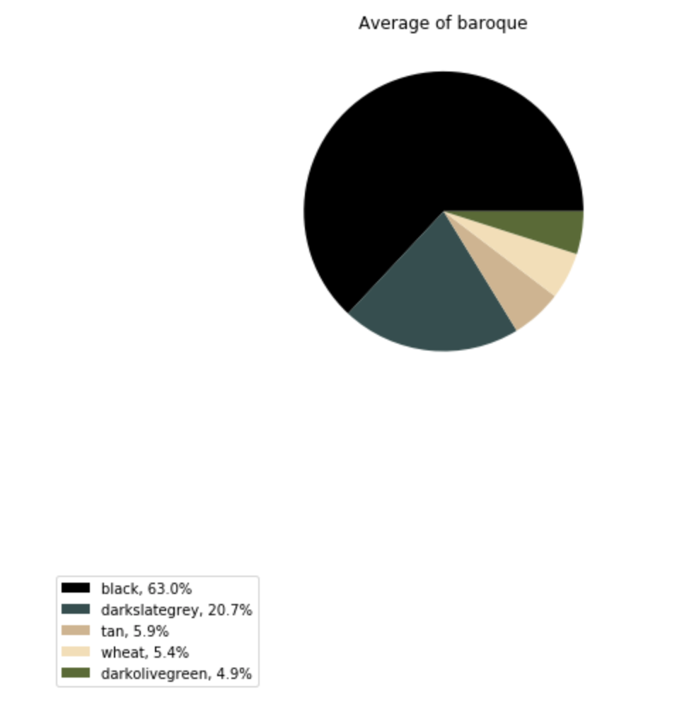
Finally, I created three pie charts to show the relative popularity of each color greater than 2% for each of our painting styles. This was the result of running the code on the right:
def average_by_style(style):
    plt.close()
    if style not in ['baroque', 'cubism', 'impressionism']:
        raise ValueError('style not acceptable, try baroque, cubism, or impressionism.')
    cut_off = 0.05
    graphs = grab_ratios(cut_off)
    color_dict = {}
    painting_sums = {}
    for painting in graphs[style]:
        sum_percent = 0
        for color in painting[1].index:
            sum_percent += painting[1][color]
        painting_sums[painting[0]] = sum_percent
        color = 0
    for painting in graphs[style]:
        for color in painting[1].index:
            painting[1].loc[color] = (painting[1].loc[color] / painting_sums[painting[0]])
            if color not in color_dict.keys():
                color_dict[color] = painting[1].loc[color]
            else:
                color_dict[color] += painting[1].loc[color]
    sum_all = sum(color_dict.values())
    tuple_set = []
    show_greater_than = 0.02
    iter_over = list(color_dict.keys())
    for key in iter_over:
        if (color_dict[key] / sum_all) < show_greater_than:
            del color_dict[key]
    new_sum = sum(color_dict.values())

    for key in color_dict.keys():
        color_dict[key] = (color_dict[key] / new_sum)
        tuple_set.append((key, color_dict[key]))
    tuple_set.sort(key= lambda x: x[1], reverse=True)
    avg_Series = pd.Series(index=[x[0] for x in tuple_set], data=[x[1] for x in tuple_set])
    figure = plt.figure(4, figsize=(10,10))
    axes = figure.add_subplot(211)
    new_ax = figure.add_subplot(212)

    axes.set_title('Average of ' + style)
    legend_labels = avg_Series.index
    def explode_sense(frequencies):
        explode = []
        for val in frequencies:
            if val > 0.02:
                explode.append(0)
            else:
                explode.append(0.2)
        return explode
    axes.axis('equal')
    new_ax.axis('off')
    explode = explode_sense(avg_Series.values)
    pie = axes.pie(x= avg_Series.values, labels=['%s, %1.1f%%' % (l, (float(s)) * 100) for l, s in zip(avg_Series.index, avg_Series.values)], colors = avg_Series.index, explode=explode, startangle=0)
    for text in pie[1]:
        text.set_color('white')

    new_ax.legend(pie[0], ['%s, %1.1f%%' % (l, (float(s)) * 100) for l, s in zip(avg_Series.index, avg_Series.values)], loc='center left')
    plt.show(figure)
    figure.clear()


average_by_style('cubism')
In my next post, I’ll be posting and comparing my results!
-
Image Comparing Software, Results

The differences I was able to spot immediately were that baroque and Impressionist art had higher use of black and dark slate grey than Cubism, and that variety was highest in Cubist art, followed by Impressionist and then baroque. Baroque had the least amount of ‘variety’, in the sense that most of the colors that…
