The differences I was able to spot immediately were that baroque and Impressionist art had higher use of black and dark slate grey than Cubism, and that variety was highest in Cubist art, followed by Impressionist and then baroque. Baroque had the least amount of ‘variety’, in the sense that most of the colors that made up the individual pieces in baroque art were less drastically different in hue.
Here are the individual color graphs for baroque, impressionist, and cubist art:
Colorway Story

Baroque
The results showed that the images of baroque art had lots of black pixels. I doubt that many of them are totally black – there might have been very dark areas of the painting with more hue to them, but the closest matching color was black. I have a theory that the black pixels are introducing noise, and that there is more to be gained in understanding the hue by brightening up the images.
This can potentially be done by slowly increasing the value of each pixel in every layer of the image (red matrix, blue matrix, and green matrix) by a set quantity until hue diversity is increased.
Since baroque art is an outlier in the three genres I decided to study, it may be that black is overwhelmingly present and shrinking the hue diversity.
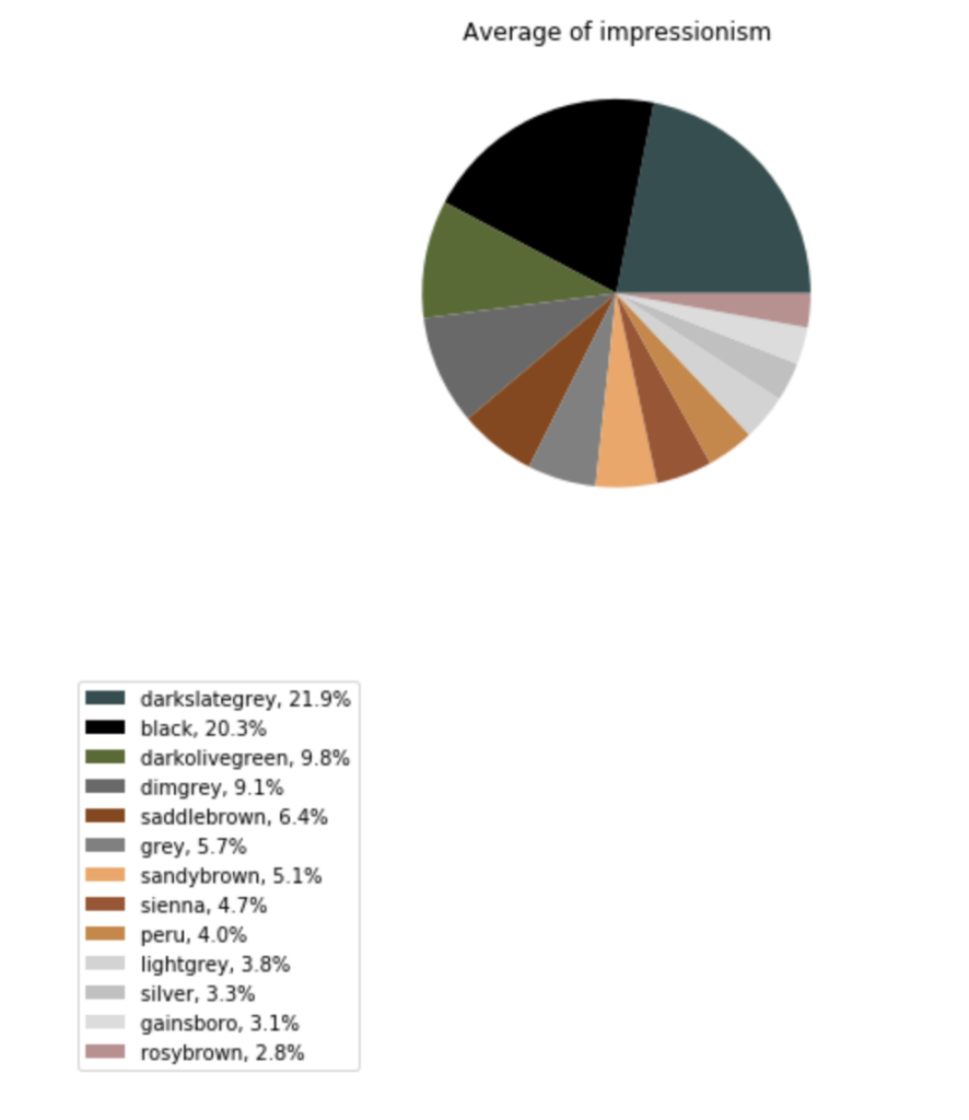
Impressionism
Initially, when I looked at the art I had thought that Impressionist art had the most colors present out of the three genres (baroque, impressionist, cubist). However, I was surprised to see that Impressionist art and Cubist art are comparable in the amount of color. Similarly, I was also surprised to see that the average Impressionist painting is actually darker than an average Cubist due to the large share of black pixels.
I noticed a lot of the impressionists use hues that are more vivid and pastel-like, but this pie chart shows that it also has more diversity than I imagined by including darker hues as well.
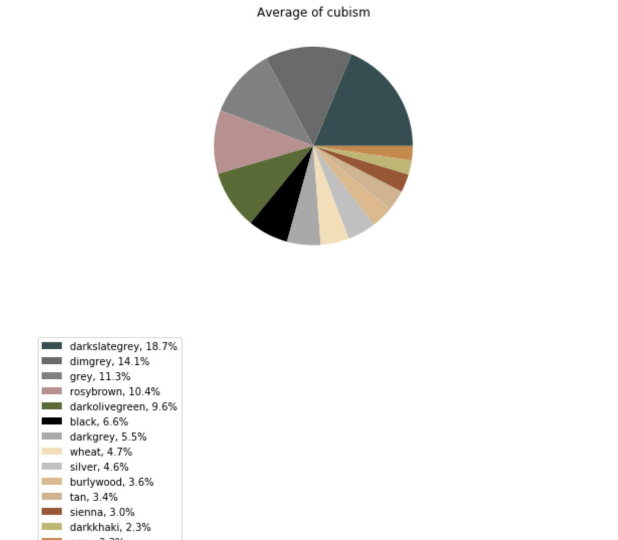
Cubism
I’m seeing a lot of lighter shades of color in the cubist pie than in all the others. I noticed that cubist paintings typically focus on giving multiple perspectives in planes to give the illusion of depth using sharp lines and contrasts in color. It may be that we can chalk up cubist painting as having more hue diversity and contrast because of this.
And that’s the conclusion of my Genre Comparison project! It was fun seeing how we can use data to deconstruct the pixels that underlie the color in art!
Latin American Art and A.I
In the future, I plan to continue my project in art by using machine learning and artificial intelligence on a bigger database of open-source artwork. For example, to understand Latin American art.
Check it out here on GitHub: Art_and_Ai